Question 3
What I liked about art 3 was the freedom in choosing what you could draw. The final project is a good example, it alllows you to explore more medias and it allows you to grow as an artist. I also like how it feels like I've learned so much this semester, I feel like I have a lot more knowledge about art. I just feel like I have accomplished so much this semester and feel like I have grow as an artist. Art 3 was fun which is how it should be, everyday I would look forward to this class and to finishing the piece I was working on. I think it is really important to actually want to go to art class and have motivation to finish your work and I think art 3 really provided that. What I would change is to maybe be more clear about all the medias we can use, even though I do like it when we are only limited to one it is more challenging and will help artist improve their skills. I also would do more of everyone sharing their pieces by placing them on the table and a paper next to it and then class can walk around and give comments about all of them. I really enjoyed that way of presenting and it allowed me to look more closely at people's work and admire it rather than it being help to far away in front of the class. Overall I wouldn't change much, art 3 was great!! :)

Question 2
The most challenging assignment from me was the first oil painting I have done. I had never tried oil painting, but I was excited to learn something new. I learned a lot about what I need to do to be successful in painting and the proper materials to use,but it turned out to be a lot harder than I had imagined. I already knew what I wanted to paint, but in every attempt I failed. I didn't know what I was doing wrong. I'm so comfortable with drawing that it was weird for me to step out of my comfort zone and try painting. I think I learned patience from this assignment. With drawing it was simple to me but painting was a challenge and more complex, so I learned to be patient and wait for my outcome. Painting is a lot different than drawing. I believe I was just being impatient the whole time and that's why it didn't turn out how i wanted it to or expected. I think I just need to practice more in order to be more comfortable with it, because overall I do think painting is fun.
Question 1
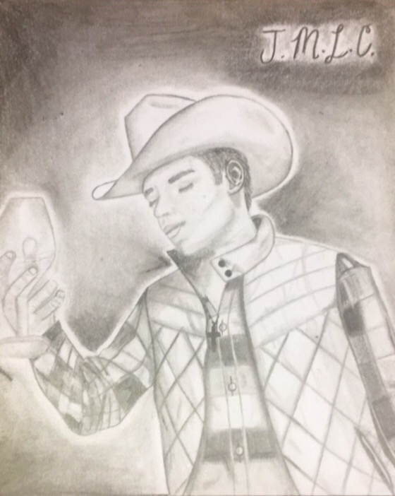
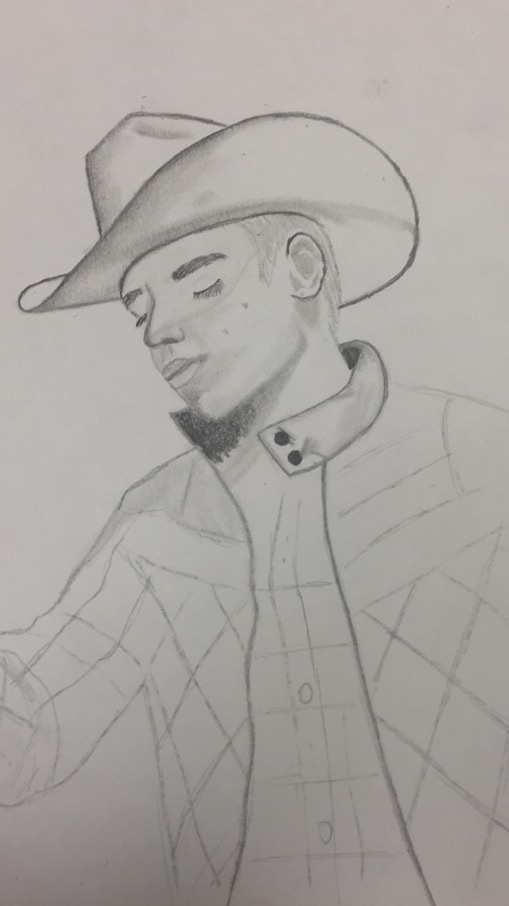
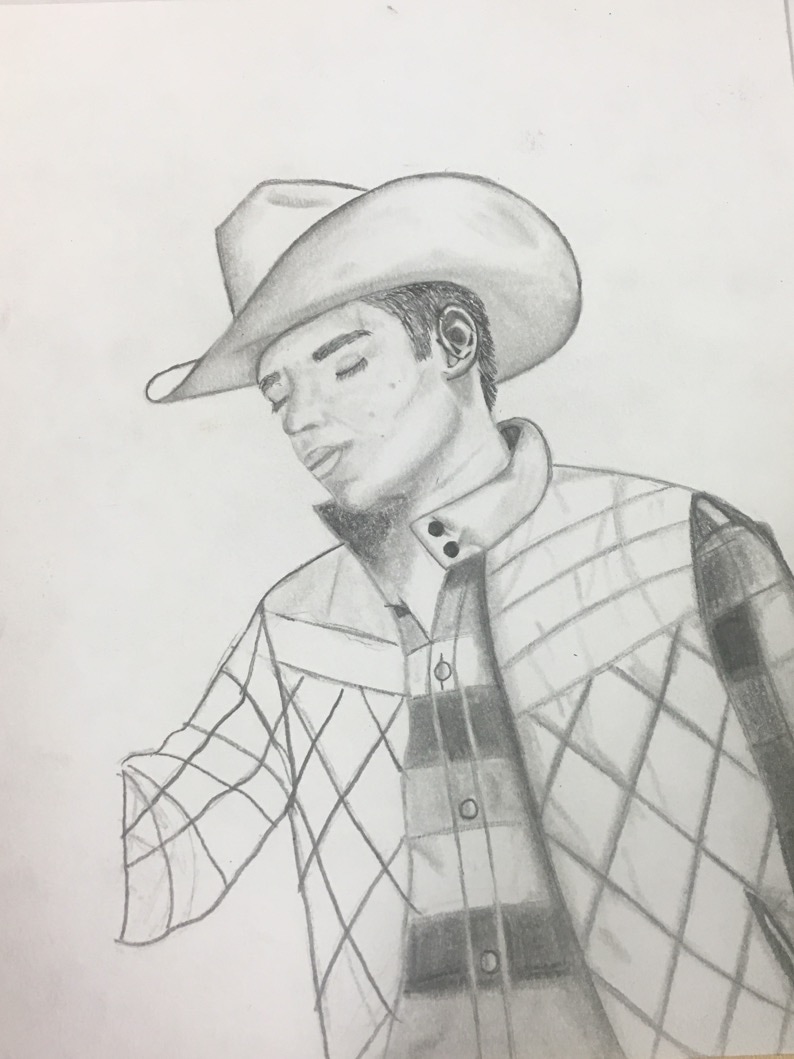
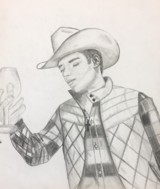
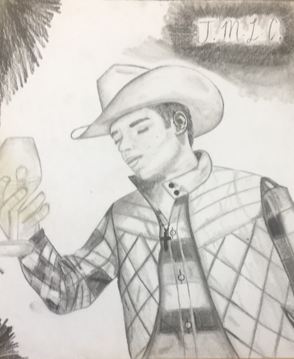
The image I am most proud of is my drawing of the cowboy. It turned out way better than I could have ever imagined. I am very proud of this piece and hope I will be trying a similar piece in the future. It was truely a great experience from the beginning, and then seeing everything come together was very exciting for me. At first, I didn't think it would turn out even close to good, I am not very experienced when it comes to people and figures but I do have a lot of experience with drawing. This project took me the longest to complete out of all my works this year, but it was definitely worth it. My favorite feature is the cowboy hat and his clothes. I am aware that there is still room for improvement, but for a first ever drawing of someone I think it was pretty good. I love the value in the piece I think it makes the drawing more realistic. I feel like his clothes are pretty spot on. I am not as happy with his face and hands but I can work on it. I have never drawn hands, I think I just need more practice. Overall, I think this image really captures my growth as an artist and really shows my drawing skills.
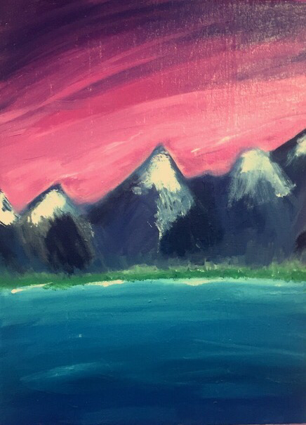
Landscape Oil Painting
I am not very comfortable with oil paints, this painting was challenging for me, but it helped me grow as an artist and I am happy with the outcome.
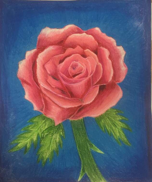
Rose Drawing in Prisma Color
I am very comfortable with Prisma Colors and Drawing so I was happy with the final result and my idea flowed nicely through the whole project.
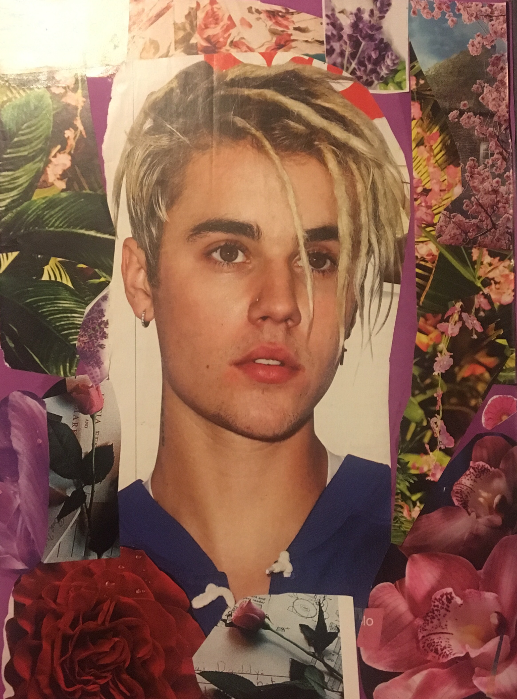
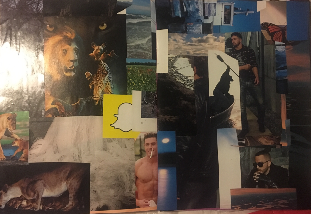
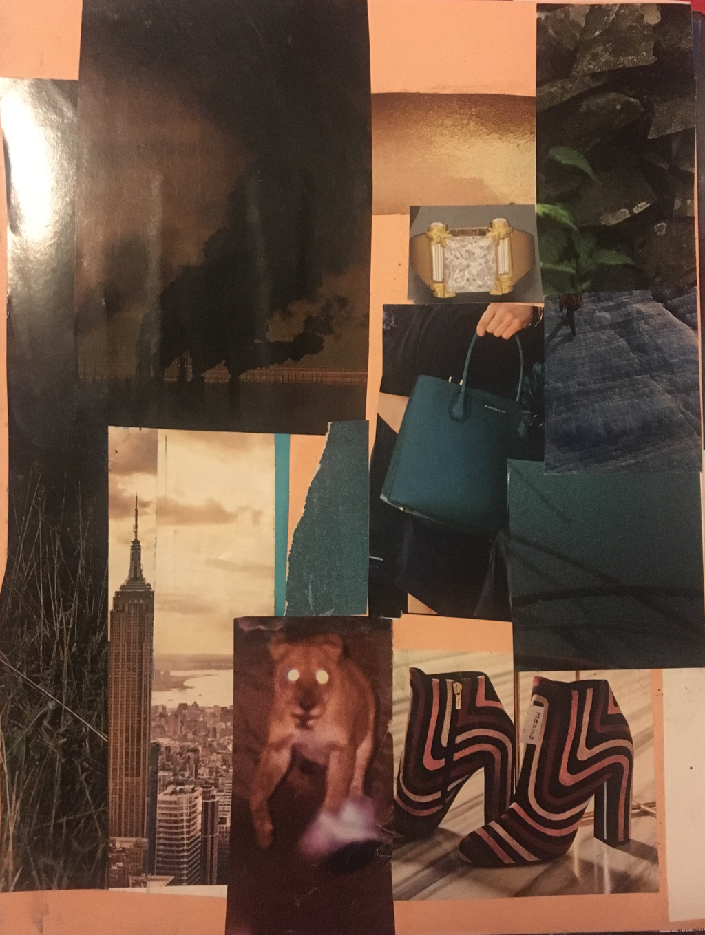
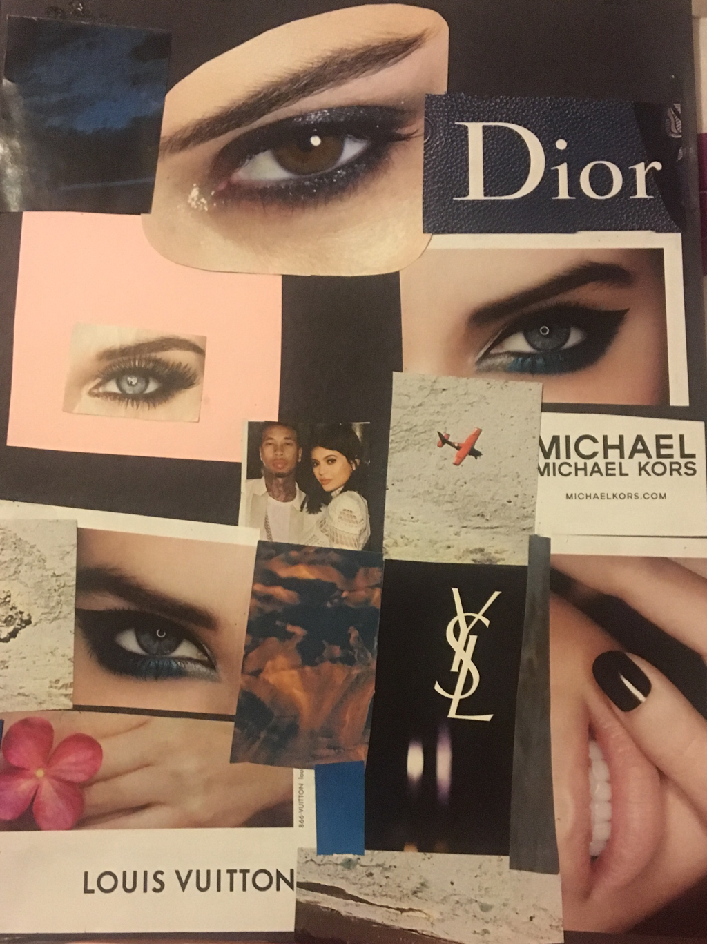
A Magazine Collage
this is a collage book made out of magazine images and text. This was a new media for me and I enjoyed it very much.

Figure Drawing
1). Throughout this unit I learned very much. To begin with I was framilar with a few techniques about the human figure, after I am framilar with so many more and have gotten pretty good at some of them. I improved my shading and my composition, also I learned how to make my work seem a bit more realistic. Also, I learned more about value. Then practice we did in class really did prepare me for this. The figure drawing did help and it helped me improve my own work. I went out of my comfort zone with this piece and I am glad I did. I am happy with the results.
2). This work is finished. I am not planning on adding more to it. The planning process was pretty simple. I struggled with coming up with an idea, so like most times I looked at my camera roll for some inspiration. I see this picture and thought it would be a challenge to draw but it would be fun and new. I started off sketching the picture a few times and it didn't seem like it would turn out good, but when I started working on my final piece it all seemed to come together. To begin i lightly outlined the drawing and then started adding more layers to improve the valure. I printed the picture in black and white and used the color photo on my phone for reference. I am really happy with how the hat turned out, I am very pleased. The face was very difficult, especially the nose, one little mark and it would look like a completely different nose and person. I messed up a few times on that. At first the proportions were really hard to get right. I was drawing the hat big but the head smaller, it was stressful but I finally got it right. His vest and shirt were fun to draw.i tried to get those as realistic as possible too. I think my work was successful, it was a challenge but I overcame it. It is definaltey one of my better piece of all time.
2). This work is finished. I am not planning on adding more to it. The planning process was pretty simple. I struggled with coming up with an idea, so like most times I looked at my camera roll for some inspiration. I see this picture and thought it would be a challenge to draw but it would be fun and new. I started off sketching the picture a few times and it didn't seem like it would turn out good, but when I started working on my final piece it all seemed to come together. To begin i lightly outlined the drawing and then started adding more layers to improve the valure. I printed the picture in black and white and used the color photo on my phone for reference. I am really happy with how the hat turned out, I am very pleased. The face was very difficult, especially the nose, one little mark and it would look like a completely different nose and person. I messed up a few times on that. At first the proportions were really hard to get right. I was drawing the hat big but the head smaller, it was stressful but I finally got it right. His vest and shirt were fun to draw.i tried to get those as realistic as possible too. I think my work was successful, it was a challenge but I overcame it. It is definaltey one of my better piece of all time.
in progresss pics!

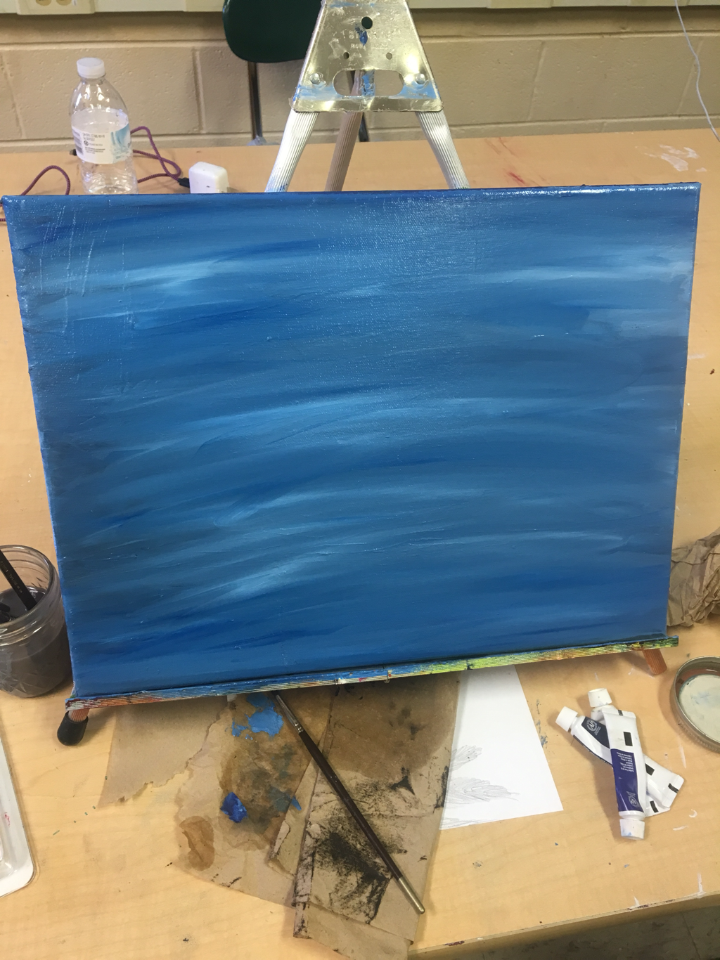
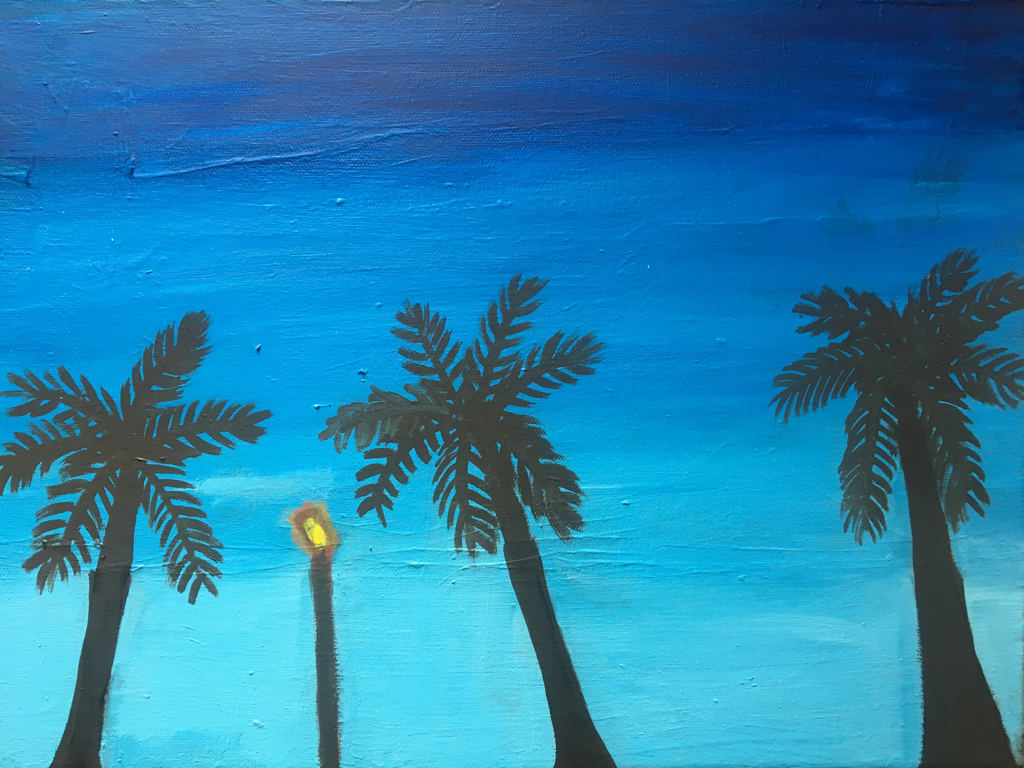
Oil Painting
1). The skills I learned in this unit were how to use oil pint in general, I had never used oil paint before so it was nice to try something new. I learned how to blend the paint, to not use water and instead use this other liquid, and also I learned what brushes to use when using oil paint. I applied this all in creating my painting. It was easy to blend the colors but the oil paint took forever to dry which was the downside of it.
2). I drew some palm trees and I got the idea from going through my camera roll and seeing some pictures I had taken earlier that year and I really liked the composition and the colors the picture had so I decided that I wanted to recreate that picture using oil paint. Planning was fairly easy I just sketched my general idea of what I wanted the painting to look like. After having my final sketch I decided to start painting. I got a canvas and started painting the background first. The background was fun to paint since it was a variety of blues. In the end I decided to do a gradient dark blue to light blue. The palm trees were going to be painted in all black but I ended going over them with a dark blue to pull everything together. I struggled with painting my palm trees, the paint was thing so I used liquin to make it less thick, so it would be easier to work with. I thought my painting turned out okay, I like it but I am not in love with it. I think it was successful, I like the background, I think it really makes the palm trees stand out. Overall, my painting was successful.
2). I drew some palm trees and I got the idea from going through my camera roll and seeing some pictures I had taken earlier that year and I really liked the composition and the colors the picture had so I decided that I wanted to recreate that picture using oil paint. Planning was fairly easy I just sketched my general idea of what I wanted the painting to look like. After having my final sketch I decided to start painting. I got a canvas and started painting the background first. The background was fun to paint since it was a variety of blues. In the end I decided to do a gradient dark blue to light blue. The palm trees were going to be painted in all black but I ended going over them with a dark blue to pull everything together. I struggled with painting my palm trees, the paint was thing so I used liquin to make it less thick, so it would be easier to work with. I thought my painting turned out okay, I like it but I am not in love with it. I think it was successful, I like the background, I think it really makes the palm trees stand out. Overall, my painting was successful.
In progress picture vs Final painting
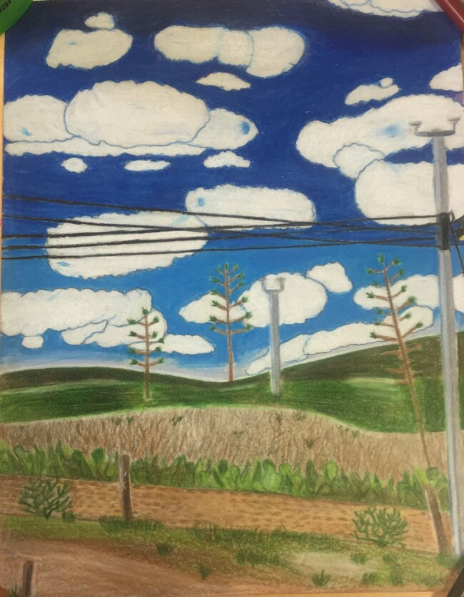
Prisma Texture Project
1). The textures I created in my drawing are all mainly on the bottom part of the drawing. I created texture in the cactus, the stone fence, the grass and dirt. I also tried to crest some texture in the clouds and the sky. In the sky I applied a lot of pressure to the prisma so I could get a smooth and more shiny surface. In the mountains, it was a lot of layering of different colors. The mountains weren't just green but they were a variety of colors so that is what I tried to achieve by layering. For the cactus there was a lot of just going back and adding more to make it look like it had texture. In the clouds I tried to add some blue to create a balance and some texture. I also used a lot of highlights throughout the whole piece to give it texture.
2). In this project I improved my skills with prisma colors. I had previously used prisma colors already so this project was just more practice. I'm happy with the results. It was the first time I have drawn a sky and clouds using prismacolors so that was different. I got more practice with my blending which is good and I think I just learned more techniques to use for future projects. A struggle I had to overcome was the sky it was complicated with the clouds and it took a long time but I think it turned out pretty good in the end. Also, there was a lot of green in the picture and I had to find a way to not make it all look like a big blob of green so I had to mix some colors together. The picture had a lot of details and I tried to get as many as I could on there. Overall, I am very happy with how my final piece turned out.
2). In this project I improved my skills with prisma colors. I had previously used prisma colors already so this project was just more practice. I'm happy with the results. It was the first time I have drawn a sky and clouds using prismacolors so that was different. I got more practice with my blending which is good and I think I just learned more techniques to use for future projects. A struggle I had to overcome was the sky it was complicated with the clouds and it took a long time but I think it turned out pretty good in the end. Also, there was a lot of green in the picture and I had to find a way to not make it all look like a big blob of green so I had to mix some colors together. The picture had a lot of details and I tried to get as many as I could on there. Overall, I am very happy with how my final piece turned out.
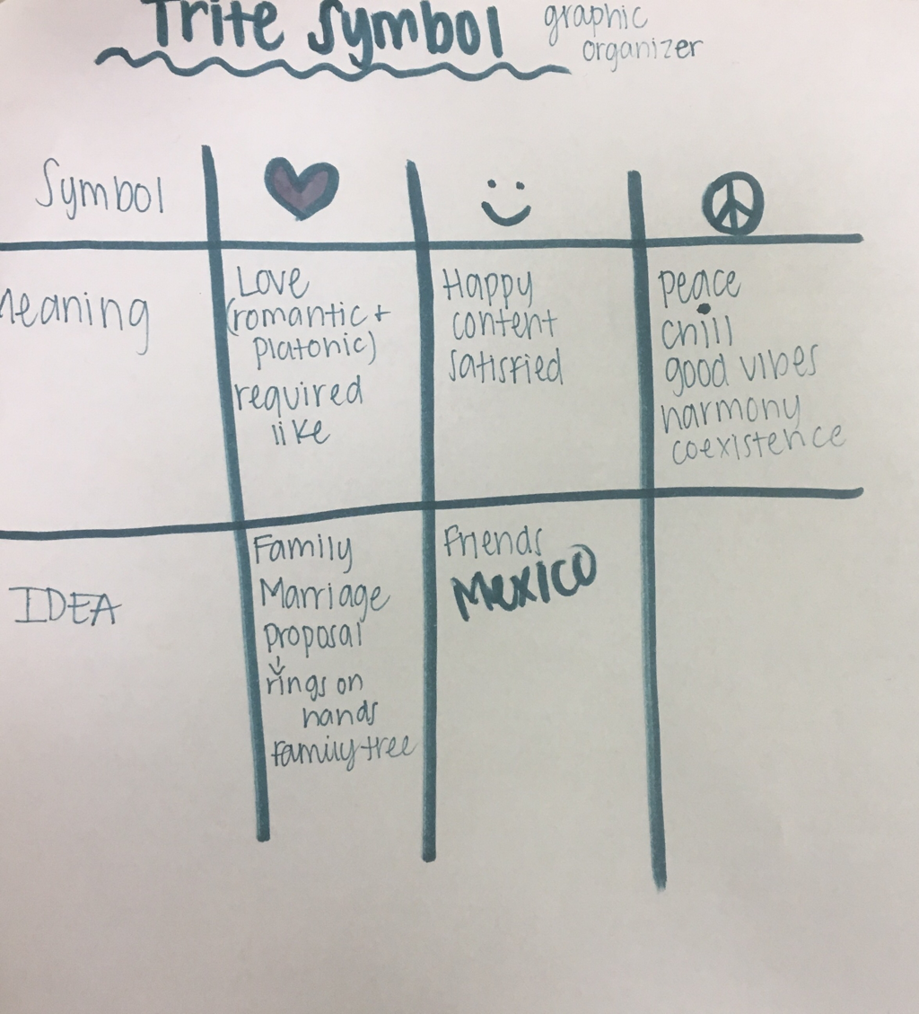
Trite Symbol
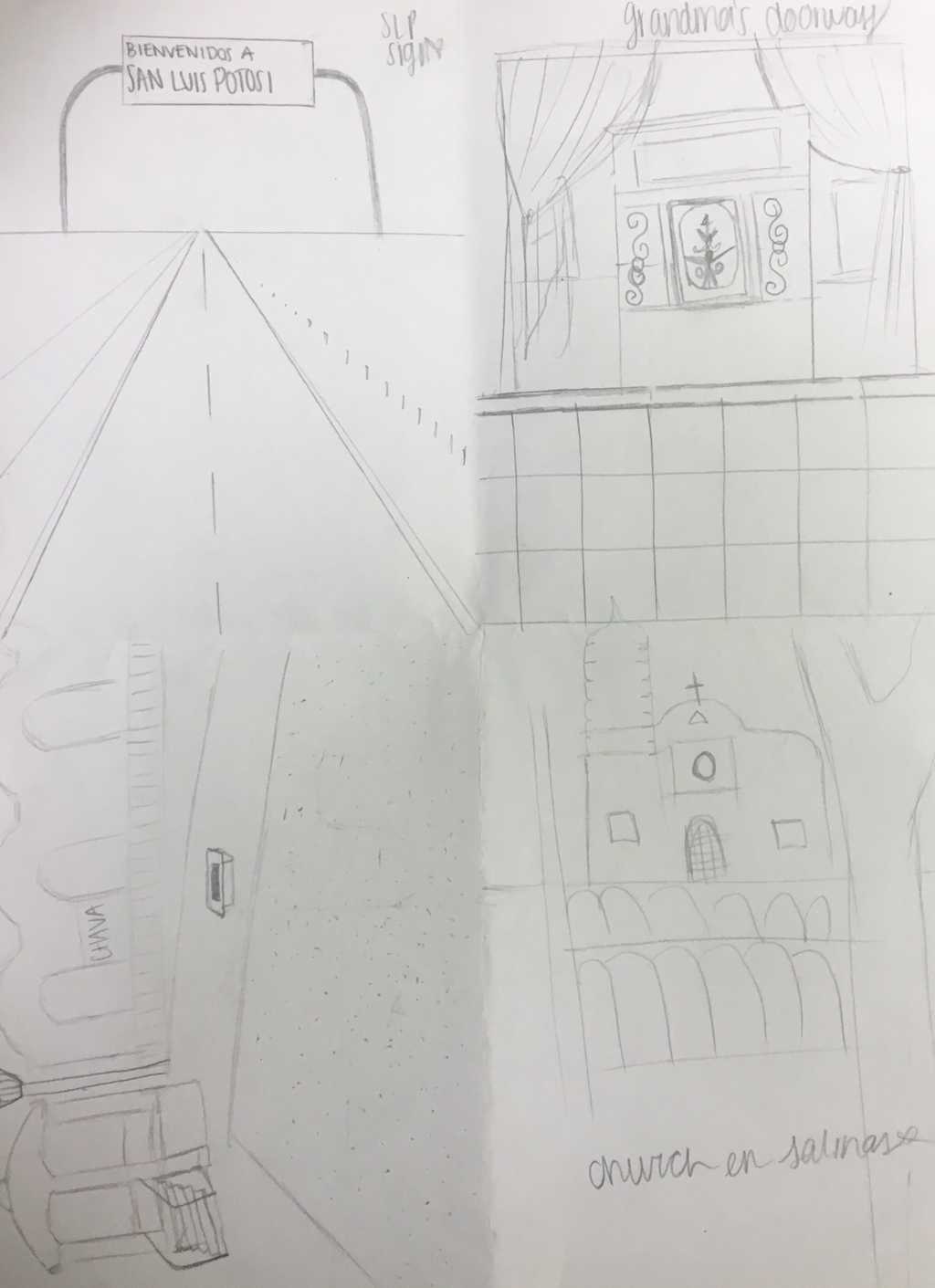
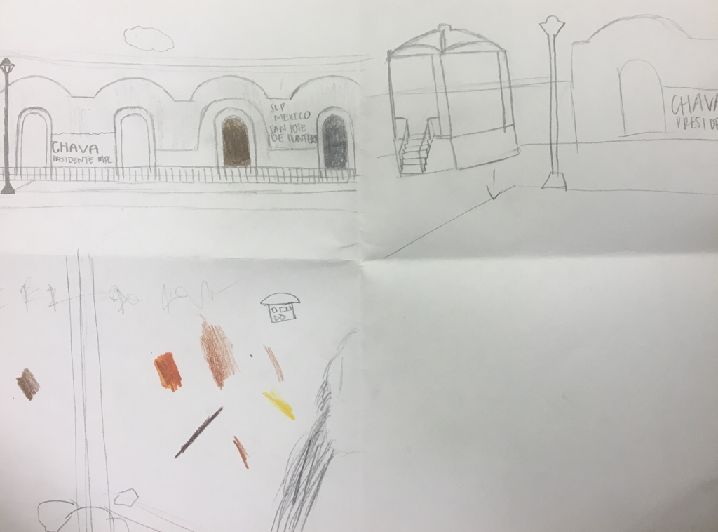
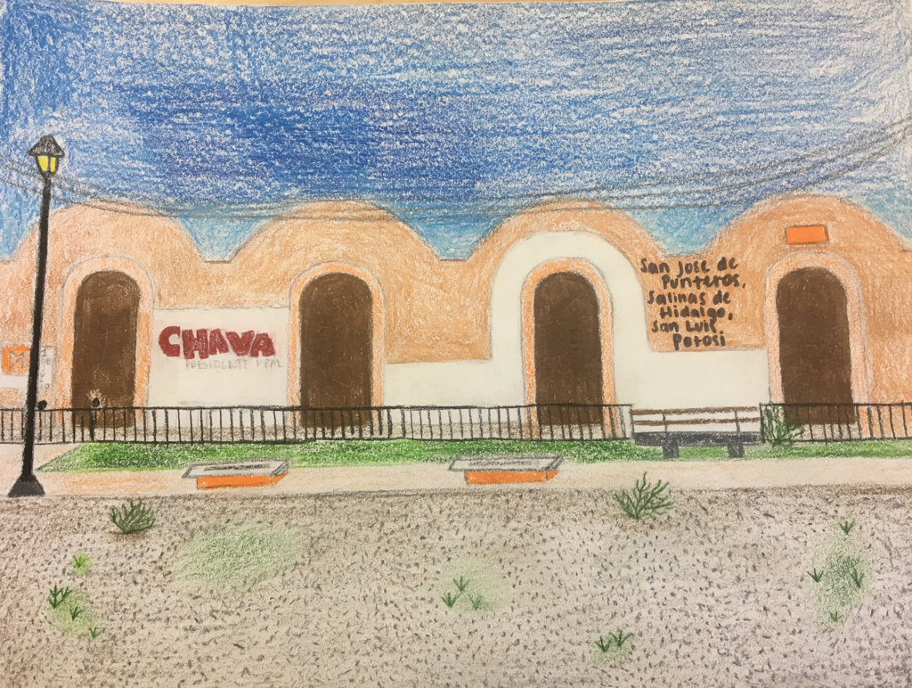
1). I chose the smiley face as my trite symbol. It represents happiness. My project is origins because it says a lot about me and I took the picture I used. I drew a building in Mexico. The building is in the plaza of my rancho, where my family is from. It represents happiness because I love Mexico and I am very happy there. I recently went to Mexico last December and some of January, i was living there for a month. I was so happy there I did not want to leave. The project was to take a symbol and draw something that represents it and I drew the plaza in my rancho, because to me it represents so much happiness.
2). My art work was successful to me. I used prisma colors to draw and I didn't press to hard on them because I felt like it would look better and more realistic. The building in Mexico was faded and old so that is how I tried to make the drawing appear. I think my composition looked good and worked for the paper. Also, I drew all the gravel on the floor individually so I think that also made it seem more like the actual building. There were a lot of details in the drawing so I tried to get them all to be close to the real thing. Overall, I am happy with my final piece and every time I look at it, I am reminded of my happy place, San Jose de Punteros.