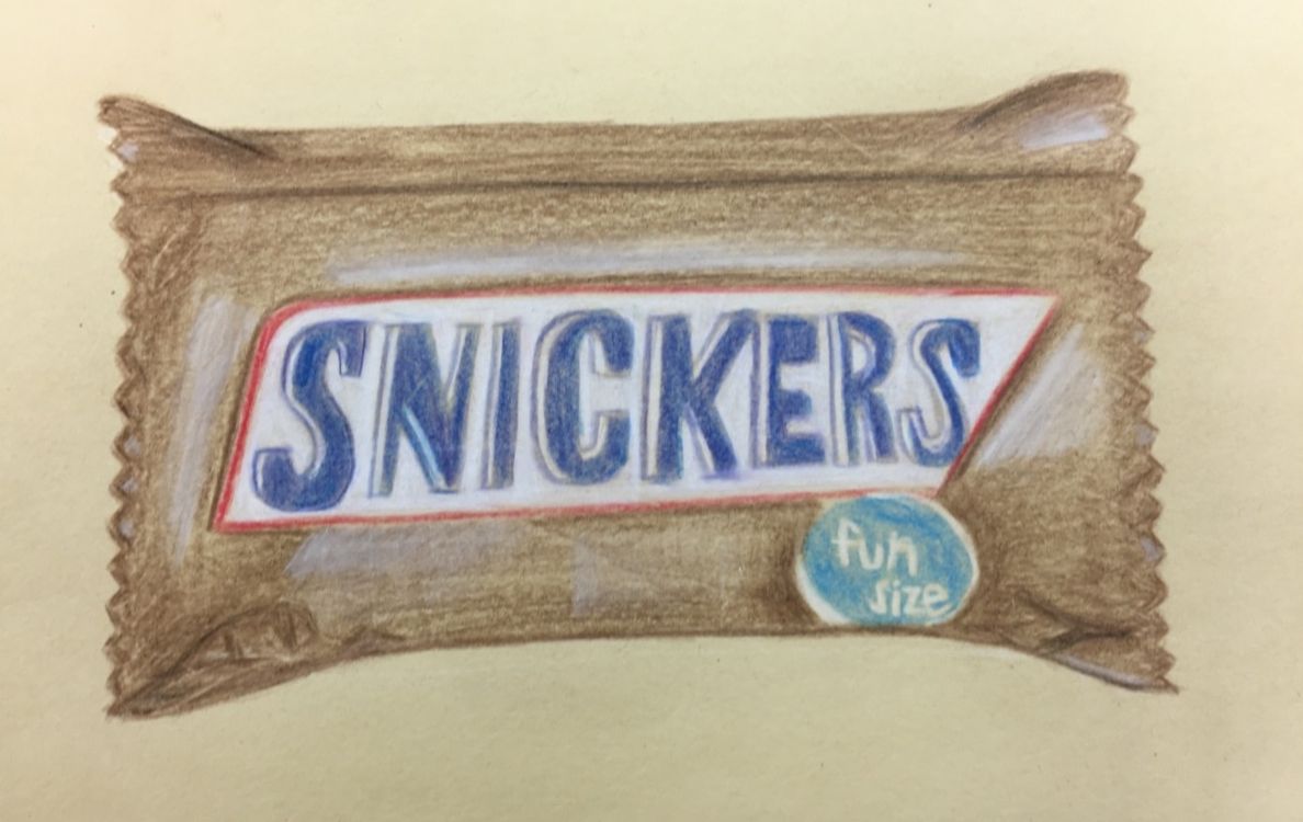
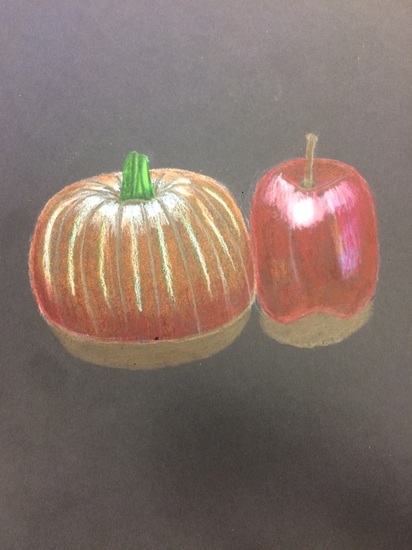
Self-Evaluation:
1. I created an interesting point of view by using 2 point perspective to draw a cake. I think it was successful, it looks pretty good. I think I could've probably been a little more creative, but I'm happy with my work. 2. It's important to understand perspective because it makes such a big difference in a drawing. I learned so much this unit and I think I became a better artist. If you use perspective correctly it will make the biggest difference in your drawing and make it look a lot more realistic. it really makes abig difference. 3. The colored pencil exercises were helpful because I had never used prisma color and it helped me get used to it. I found out which shades worked better on the black, brown, or grey papers. I found out that it's easier to blend colors and build them up. Also, there is a variety of colors which is nice. 4. I applied more pressure to the pencil when I wanted it to be darker applied, I also used different shades to create value. I added some white to the flowers to add highlight and added black to the center of the flower to give it depth. I outlined some of the flowers in white to make the pop out a little bit more. 5. I showed depth in the flowers, that was probably what I focused on the most this project. I didn't have a background since the cake took up most of the space, I thought it was best to just leave the cake by itself. 6. My overall experience with the prismas was good. At first I was unsure if I would like them since I had never used them, but i ended up really like them. It's easier to blend and build up colors with them. Also, there is a variety of shades so you can create value easily. Some of the obstacles were that they would blend easy so I had to be careful when using the white right next to the bright blue. 7. Looking back I am pretty happy with how my artwork turned out. I'm not really sure what else I would like to know since I already learned so much with the perspective and the prisma colors. I do feel like I was prepared for this project, there wasnt a time where I felt unprepared. These are some in progress pictures I took from the first up to the last day I worked on this project.
I really enjoyed using prisma colors, it was so easy to blend and build up colors. I had never used them before so I was a little unsure about how I would like them, but in the end I ended up really enjoying them. They seem like regular colored pencils but they are way better in my opinion. It was easier to get different values of color and also to make your colors very bright. You could make your colors darker or lighter, and there was a lot of variety of colors. We tried the prismas on black and brown paper. I l think some colors worked better on the black paper and then some others worked better on the brown paper.
These are the still life compositions i came up with. i thought they all came out pretty good,but i wasn't sure which one had the best composition to draw, so i am glad that Ms. Rossi was able to help us choose.
Questions-
2. Are your values and shadows realistic? How many values did you include? How and why are values important? I think my values are realistic for the most part. I included a wide range of values from light to medium to dark. The values are important because they add a lot to a drawing and make it look more realistic. 3.Is there a clear source of lighting? Yes you cam see in every object the highlights that show where the light is hitting. 4. How important were the compositional sketches? Explain. The compositional sketches were very important because it helped you arrange your ideas how you wanted them. If you messed up it wasn't too bad since it was just a sketch, the compositional sketches help you to get organized before you move on to the final drawing. 5. How is your final drawing successful? My drawing is successful because it looks pretty good, i manged to put a lot of objects in it. There's a wide range of values and it looks pretty realistic. 6.Are the proportions, structure and perspective of the subject correct? Yes, most of the proportions are correct and the structure is good too. The perspective was also good. 7.Does the placement & grouping of objects create a pleasing arrangement (composition)? I think it does because you get to see a variety of objects and yes overall the arrangement is pleasing. 8.Is there a center of interest and is it well located? There really isn't a center of interest in my drawing specifically. If i had to pick it would be the American flag. 9.How well did you manage your time and resources throughout the process of creating this drawing? Do you see where you could improve in this area? I spent all the time we had in class to work on this drawing, i finished a little early. For improvement, i will just take more time probably to just make sure everything is good. 10.What challenges did you encounter during this project and how did you overcome them? I just thought the still life was hard but i just didn't give up and finished it. 11. What have you learned drawing a still life? I learned to take your time and the sketches really do help to prepare you for the final drawing. Fabric Drawing Self Evaluation
Isabella Corpus 1. I did use a wide range of values, it is evident because you can see in the fabric the dark areas, the white areas, and the areas that are in the middle of the value scale. 2. The studies helped me because i got a better understanding of how to do it. Also being told to draw little cones helped me a lot and made it easier to draw the fabric. I also think that practicing to draw the fabric really helped prepare me for the final. 3. For the blending and transitions i used different pressures.I was using charcoal pencil so if i wanted an area to be dark i would apply a good amount of pressure until i liked it. If i wanted a middle value i would only apply a little bit of pressure and if i barely wanted value in an area i would apply very little pressure. For the transitions i would just try to blend it in so it looked like a smooth transition.I just followed the shadows i saw on the fabric and that is how i drew it. 4. Your interpretation of texture is important because i think texture adds a lot more detail and makes the drawing look a lot more realistic. When you capture the right texture of an object and manage to draw it, it just makes your drawing look a lot more realistic and better. 5. I actually like how this drawing came out, but there is always room for improvement. So, if i could go back i would add more darkeness to the darker areas of the fabric and work on some transitions. I would make them smoother and just try to blend everything more. This week we learned about value. We took some notes on value and drew a value scale, then we practiced drawing shapes with value. We used charcoal and also pencils to draw. I had never really worked with charcoal before, but i really enjoy it now. I think value is important to a drawing because it adds a lot of detail. We also learned how to draw fabric, which i found to be really fun.
Isabella Corpus- Self Evaluation.
1. I did use fluid line for this drawing, It is evident because all the details connect to each other. 2. I think all the practice drawings we did helped me a lot because at first it was hard to get used to not lifting up the pen and creating one fluid line. So, the practice drawings we did, helped me get used to drawing using a fluid line.m 3.Outline is drawing lines around the object and contour line drawing is drawing lines in the object. 4. The interpretation of line is very important because it is all you are using. You are using a fluid line to draw a whole picture so you have to try to make the most out of the line you are using. ' 5. From completing this drawing i learned how to draw using a fluid line. If i could recreate this piece i would try to make my lines straighter, i would try not to mess up as much also.I think if the lines were straighter it would look better, so i would probably just take more time in drawing the room to avoid too many mistakes. |
AuthorWrite something about yourself. No need to be fancy, just an overview. Archives
January 2017
Categories |