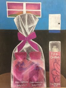
1. Yes i think it is neat and well executed. The only thing is that it looks a bit scratchy on the wrapper part, i think i could have smooth that out more and it would have looked even better.
2. I think the background compliments the main part of the drawing because the sunset uses the same kind f colors which compliments ecah other. Also the background is more plain whic allows the lotion and perfume to stand out more against the background.
3. I choose to use pinks and roses as my colors. I really like those colors so i decided to use them and im happy i choose that. The bows color is my favorite. I also used those type of colors for the sunset in the background which i think compliments it well. For the floor i used black and i think it helps the wrapped lotion stand out. Also for the wall i choose a blue and i think it turned out well. I was hesitant at first because i didnt know if it would compliment the pink well, but it did.
4. I created contrast by using darker pinks and using the blue and black in the backgrouond.
5. I used highlights to give it that look of opacity, and i think it turned out well. It looks like thr lotion is wrapped up. I used a lighter rose on top of the bow and a darker pink for the bottom, to create contrast.
6. I choose black because i wanted the lotion and perfume to stand out and i used thr blue to give it a different look and change things up a bit.
7. I used prismas for the project and i think its important to know how to blend them and create value and shade to create a succssful project.
8. A difficutly i ha was not knowing what to draw as the background. If i could change anything i would amke the highlights of the wrapper a little bit more smoother.
 RSS Feed
